Without the foundation
Each new screen is its own isolated decision. Junior designers inherit inconsistency. Dev handoff is ambiguous. The product drifts as the team grows.
Copilot.cx
Copilot.cx had a technology platform, a VP of Product with a vision, and no design practice. I came in one day a week, mapped the product with the Head of Design, built the system, designed the core flows, and helped grow the team that could keep going without me.
Business & Product Framing
Copilot.cx serves consumer electronics brands — Tzumi, C+A Global, TempDrop, Nexxt — giving them tools to rebuild the customer relationship after a device leaves the shelf. The technology worked. But design had been handled by an outsourced studio, there was no in-house practice, and the product experience did not reflect how a marketing manager actually thinks. I joined as the first in-house designer, one day a week, working alongside the Head of Design to map product opportunities with the VP, establish the design direction, and build the system and flows the team would carry forward.
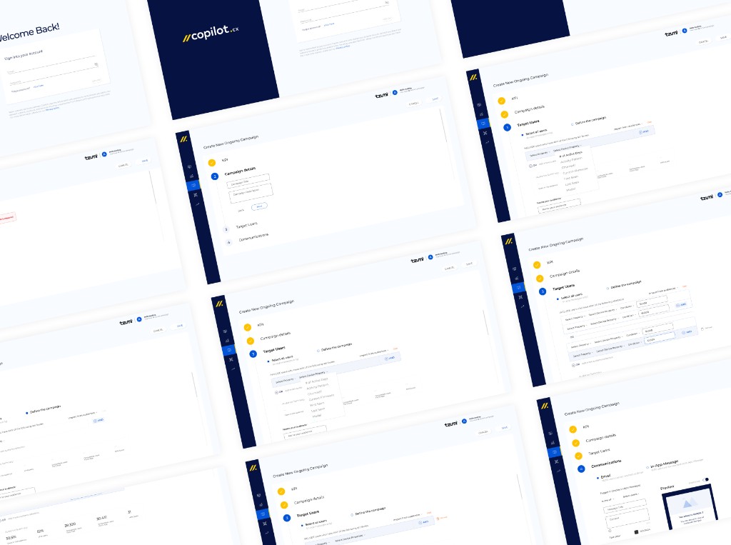
Navigation system. Four primary sections, designed as a component with all expand/collapse states defined — before individual pages were built.
The Problem
No in-house practice. No existing product to copy. A team that would need to keep building after I stepped back.
Canvas builder IA. Results vs. editing mode, blank vs. template-loaded — mapped before any screen was opened. Every state needed its own design before the first component was built.
Email tools are built around contact lists. CRMs around pipelines. Neither maps to IoT — where a "user" is also a device owner, where "engagement" includes firmware events, and where triggers connect to real product behavior. There was no reference pattern. The platform had to define its own language.
The users were not engineers. They thought in questions: Who are my most active users? Who stopped engaging? What should I run this week? The challenge was not to expose the data. It was to make it actionable for marketing managers.
And the practice gap ran deeper: no shared component library, no handoff process, no shared language between product and engineering. Two junior designers would soon join — this would be their first product project.
"The question was not 'what data should we show?' — it was 'what does a marketing manager need to know before they can act?'"
Key Decision
Before building anything, the foundation those flows would live inside had to exist.
The pressure was to move fast — the VP had requirements, the product needed to ship. But moving fast without a foundation would mean rebuilding everything later, inconsistently, by a team that had never used Figma components before. The more durable move was to slow down enough to build the system correctly, then accelerate.
Each new screen is its own isolated decision. Junior designers inherit inconsistency. Dev handoff is ambiguous. The product drifts as the team grows.
Components are decided once and referenced everywhere. New designers onboard to a shared system. Handoff is a component name, not a conversation. The product scales without losing coherence.
"I was not just designing a product. I was building the design infrastructure a growing team would inherit."
The frame that shaped the order of work
I built the Figma component library — colors, typography, interactive components — mapped to Ant Design, the front-end UI library the engineering team used. That handshake between design components and dev components gave the team a shared language. Handoffs stopped being explanations and became references.
Design tokens. Color system and usage rules — the first layer of the component library, mapped to Ant Design's token structure so design and front-end shared a single source of truth.
Component states. Every interaction state defined and documented — so developers and junior designers had a reference, not a conversation.
Design Moves
Product IA. Component system. Campaign flow. Segmentation. Canvas builder. Each one a decision about what the team was building and how they would build it going forward.
Map the full IA before designing any screen
The product needed a clear navigation model: from dashboard state to drill-down analytics, into the campaign builder, and through to the canvas builder for content creation. Designing individual screens without that map would have produced inconsistency. The full hierarchy was mapped first — with the Head of Design and the VP — so every screen had a known place in the system before it was designed.
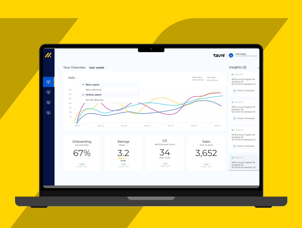
A dashboard organized around decision-making, not data organization
Before building anything, I learned how marketing managers actually think. They open a platform with a specific question, not to explore. The dashboard was structured around four: active users, NPS, campaigns running, what to act on next. KPI cards for onboarding, ratings, CS, and sales gave a scannable second layer. Everything else was accessible — but not in the way.
Make the campaign flow a guided sequence, not an open form
An open builder gives the user a blank page. A guided sequence gives them the next decision. Five steps: KPI → Audience → Trigger → Name → Description. Channel choice came first, so every following step could adapt to it. The form was not static — it responded to what the user committed to.
Dashboard. Overview trend, KPI cards (onboarding, NPS, ratings, sales), and actionable insights — the four questions that opened every session, made scannable.
Campaigns overview. Status badges, sortable columns, row-level actions on hover — the list view that gives a marketing manager their full campaign picture at a glance.
Turn audience segmentation into a conversation, not a query
IoT segmentation is powerful and opaque — four filter types, behavioral conditions, time logic. Each condition was expressed as a plain-language row. Audience size updated live as filters were added. No query submission, no waiting. The feedback loop turned segmentation from a technical task into a judgment call — which is what marketing managers are actually trained to make.
Final UI — Tzumi. Plain-language conditions, live audience count, saved audiences. Every filter added updates the count in real time.
Start the canvas builder as a drag-and-drop content system
The final step in the campaign flow was content creation — a drag-and-drop canvas builder for email and in-app message templates. This was a new product surface with its own complexity: flexible layout, multi-channel constraints, non-technical users. I designed and architected the canvas builder during the deepest phase of the engagement, laying the foundation the team could continue building after I stepped back.
Canvas builder. Audience node, drag-and-drop action sequence, channel selection on the right — the content creation surface that closed the loop from insight to campaign.
How the Team Was Built
The engagement grew as the need grew — and contracted as the team became capable of standing on its own.
I started one day a week. The Head of Design and I worked alongside the VP to map product opportunities, align on requirements, and establish the design direction. As delivery demands grew — and as the Head of Design began recruiting the first junior designers — I expanded to three days. The component system, the handoff process, the Figma working practices: all of that was built during this phase, with the explicit goal of making it learnable by people who were joining the team for the first time. The two junior designers who joined had never used Figma in a product context. I led the introduction to component-based design, showed them how the Ant Design front-end library mapped to what was being built in Figma, and ran the early dev handoffs with engineering — establishing the working pattern so they could eventually own it. When the foundation was solid and the team had what they needed, I stepped back.
Insight cards. Regular, hover, and after-reading states — documented so junior designers knew exactly what an insight looked like in every context, without needing to ask.
Outcome
The measure of this work was not what shipped during the engagement — it was what kept running after it ended.
Core flows designed
Dashboard, campaigns list, campaign builder (5-step), audience segmentation, and canvas builder — the full product loop from insight to campaign delivery.
Junior designers onboarded
First Figma product experience for both — introduced to component-based design and dev handoff through the working system, not a training session.
Component system
Figma library mapped to Ant Design — color tokens, typography, interactive components with all states defined. Built to be the team's single source of truth.
Engagement scale
Days per week as the product scope and team grew — stepped back when the practice was solid enough to continue without the engagement.
Principles that scale, not just a handoff deck. The handoff to engineering was not a list of mockups. It was a system of principles: how different data views connect to decisions, how the four-question framework scales to new features, how the insights engine interprets different data types. I documented not what to build, but how to think about building it.
This meant engineering could ship new features confidently without coming back for product review on every detail. It meant the product could grow beyond my initial work, because the team understood the logic, not just the interface layout.
The company went on to raise more funding and triple its headcount. The practice scaled with it — because the foundation was built to be extended, not rebuilt. That is the metric that matters most on a contract this short: not what shipped, but what held up.
Reflection
Insight precedes form. The approach that won started with a simple insight: four questions. Everything else — the interface layout, the metrics, the data views — flowed from that realization. The best thinking begins with reframing the problem, not sketching solutions.
Building a team is also a design problem. Setting up junior designers to succeed on their first Figma project required the same thinking as designing a good user flow: where does someone start, what do they need to understand first, what happens when they make a mistake? The component system and the handoff process were designed for the product — but also for the people who would use them next.
Knowing when to step back is a senior skill. The goal was never to be indispensable. It was to make the engagement unnecessary — to build the foundation clearly enough that the team could continue without having to reconstruct what had already been decided. The measure of that is not how much was shipped. It is how well the work held up after departure.